Sunday 28 February 2016

Martin Ramirez Hidden Worlds

Martin Ramirez was a Mexican farmer whose property and livelihood were destroyed by the Cristero rebellion. He wandered into the United States where, confused and unable to make himself understood, he was admitted to a psychiatric hospital. He spent the rest of his life in such institutions, filling his time by drawing compulsively on scraps of paper. His work gives an insight into his private world, filled with concentric arcs, trains, and figures seemingly trapped in empty rooms.


I've never taught a lesson on Ramirez before but his work really fits with the theme of 'Hidden Worlds' which I'm soon to introduce to my GCSE students. I want my students to consider the autobiographical nature of Ramirez's work, seeing it as a depiction of a nomadic journey culminating in incarceration in a sterile, clinical environment.

Each student will draw a Ramirez style piece in fineliner. I'd like each image to include; a centralized figure, a train, concentric circular lines, straight lines, one opaque black region and two regions shaded into subtle tones of grey. Students will have a variety of Ramirez's original pieces to take inspiration from, as well as my two examples below.


Work will be assessed on student's imagination, arrangement of the different elements on the page, and how well the piece captures the spirit of Ramirez's vision.


Saturday 27 February 2016

Jean Michel Basquiat Inspired Scribble Portraits

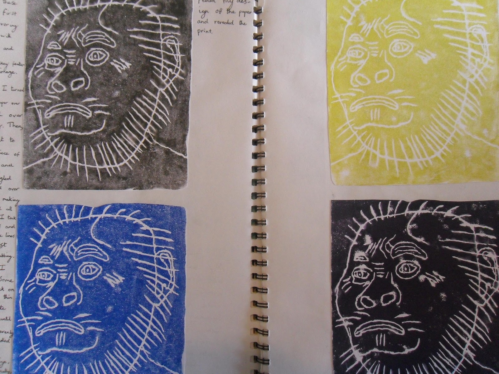
Jean Michel Basquiat is one of my favourite modern American artists. His densely layered work Untitled (Skull) is a masterpiece of raw power, primal energy and subtle, jazz-influenced flow. I teach a Basquiat inspired project every year, giving my students the chance to appreciate his unique artistic vision.


I've approached teaching Basquiat-style portraits in a number of ways, and I've used a wide array of materials and approaches - for example, one year we used corrugated cardboard, nails and soil from the centre's garden! This year I felt like sticking to more traditional media, and so here's a Basquiat inspired lesson involving oil pastel, marker pens, chalk pastel and acrylic paint.

First, students should choose from either coloured marker pens, chalk pastels or oil pastels and then scribble wildly all over the page. They can stop to change colour and begin new lines whenever they wish. Their lines can be angular and jagged or curved or organic - it's best to let their preferences and mood influence the marks they make.

Once a suitably tangled web of multi-coloured, scribble lines has been constructed, students can then change to either black marker pen or black pastel and begin to draw a heavier outline around the scribble, marking off the rough shape of a face, either in profile or straight on. Details like eyes, noses, ears, facial hair and glasses can then be added.

Any space left outside of the face outline should then be coloured with the student's choice of media. I used a blue oil pastel for my first example, yellow and pink acrylic paint for my second and light green chalk pastel for the third.


This lesson is a failsafe - students' needn't worry about getting it wrong as any 'mistakes' can easily be incorporated into the final piece.

Friday 26 February 2016

Fantasy Creatures

After a holiday, I always try to ignite student's enthusiasm for art making with a fun project that will capture their imaginations. As we've just come back to school after the February half term, I decided it was a good time to introduce a mixed media fantasy creatures project.

Initially students racked their brain thinking about the sort of fantasy creatures they've heard about in myths, ghost stories, fantasy novels and video games. This yielded a huge list of imaginary animals and monsters. Each student then sketched a rough design of their creature in pencil before going on to draw a larger version of it. When they were happy with their design, they set about painting their creature in tempera paint.

Whilst their painted creature was drying, students used tissue paper to create a collage background to mount their animals on to. Finally, the young people used an array of three dimensional materials (pom poms, pipe cleaners and string) to give their pieces some extra visual pop.


Wednesday 17 February 2016

Underwater Scenes in Oil Pastel Resist

I've been wanting to plan an oil pastel resist lesson for quite awhile and, as water is such an important part of this technique, I thought I'd create a suitably aquatic image.

The first thing I did was draw out my underwater scene in oil pastel. I made sure the lines were really thick and chunky so that they'd have enough body to push away the water once I painted on top of the drawing.


I then thinned out some blue tempera paint with water. You only need to add a small amount of water to the paint, but do make sure it's mixed in to the paint properly.


Then you can spread the paint thinly over the whole image. Don't be worried about going over the top of your original lines as the oil in the pastel will push the water in the paint away. I decided not to blend in my brush strokes too much, as I thought they gave a bit of a wave texture.


Once the blue layer was dry, I got some undiluted acrylic paint and painted in the bodies of the sea creatures. This made them really pop out from their surroundings.


I then decided to finish of the piece by drawing and cutting out some frame-style shapes on another piece of paper. I coloured and decorated these shapes with oil pastel.


These pieces could then be glued on around the edge of the image.


Oil pastel lessons are always a winner with the students, so I'm sure they'll have a lot of fun creating their underwater scenes!


Tuesday 16 February 2016

Foam Brush Printmaking

I've really got into printmaking over the past couple of years, infact it's become one of my favourite things to teach. It can be an expensive media to work in though, so I thought I'd create a lesson plan that allowed teachers and students to create prints using the most barebones of materials! For this lesson you'll need a variety of foam brushes and rollers, which are readily (and cheaply) available in any art or craft shop. I used acrylic paint for my examples, though you could just as easily use tempera paint.

Here's a photo of the brushes and rollers that I used...


The first thing you need to have students do is choose their initial colour layer. They can then create patterns and designs on to their paper in this colour.


Once this layer has been allowed to dry, students can then select the colour for their second layer. Designs and repeated patterns can then be added over the top of the original image.


This second layer then needs to be left to dry. 

For the final stage, students should choose a third colour for the last layer. It's best to be quite sparing when applying this third colour - students should aim to keep some white space on their page as it aids the pattern recognition and visual continuity.


Printmaking always has something of an 'accidental' feel to it. You never quite know how the results will look until the end of the process. It's great for students to work in this way, adding extra layers to an image until they become happy with the result.


Monday 15 February 2016

Cubist Cactus

I like to do some work on cubism every year. I think it's a great way to get students used to sketching objects from different angles. This year I've decide I'll give my students an array of cacti as their source material.

Initially, the students will draw a rectangular grid and then divide it up into four equal sections. My grid was 20cm by 16cm, but these dimensions don't really matter - it could be bigger or smaller.


Then students will make four observational sketches of their cactus, one in each of the grid's four sections. Each sketch should be made from a different angle.


Once students are happy with their pencil sketches, they can go over their lines in fineliner (I used a Derwent Graphik 0.05). After this, all pencil lines (including the original grid) can be erased.


To finish, students can add hatching, cross-hatching and additional line weight to their drawing.


Sunday 14 February 2016

Brian Selznick Lesson Plan

It's half term and I've started planning out some of my upcoming lessons! This lesson was inspired by Brian Selznick's excellent book The Invention of Hugo Cabret. Selznick is an author and an illustrator and I really love his densely shaded, heavily worked pencil drawings. They're really integral to the storytelling in his book, rather than just being a bit of superfluous page decoration.


I've designed this lesson so that students can learn various pencil techniques, and how to make optimal use of different grades of pencil. I also really want the young people to look at the ways Selznick uses mark making to add shading and texture to his images. As this is a Mixed Media Musings lesson, I couldn't leave it just at pencil drawing, so I added some additional lines and tones with graphite stick and blue grey and yellow grey Derwent Artbars. 

For part one of the lesson, I want students to select a drawing from the book and then make a transcription of it. I chose Selznick's drawing of the automaton.


I also made a copy of a detail from another page.


For homework and for the follow up lesson, I'm going to ask students to bring in a suitably evocative object from home and draw it in Selznick's style. I chose to draw a clown doll.


Wednesday 10 February 2016

Illustrations on Vintage Paper

The first part of this lesson was inspired by Lynda Barry’s excellent book Syllabus: Notes from an Accidental Professor. I highly recommend this book to anyone teaching visual arts or creative writing. It’s a real treasure; inspiring, helpful and beautiful to look at too.
My students' first task was to fold a piece of A4 paper into 16 sections. Children were asked to draw objects, animals, people and fantasy creatures into each of these sections. I asked the students to draw each of their images in as few lines as possible, aiming to make a clear representation of their subject.
For the next part of the lesson, I wanted students to experience drawing on a prepared ground. I brought out a selection of vintage-styled wrapping papers and each student chose the one that most appealed to them. The young people then recreated one of their earlier images in fineliner and felt tip, drawing directly onto the wrapping paper.
Once their drawings were complete, each student made a ‘shabby chic’ frame for their illustration using lollipop sticks and tempera paint. As this type of paint is really thin, the wood grain of the lollipop sticks was clearly visible after it dried.
Finally, the framed illustrations were offset by a pinboard which some other students had ‘upcycled’ using tempera paint, glitter glue, fabrics, beads and vintage photographs. This really added to the retro feel of the whole display.
(in


Monday 8 February 2016

Pictures and Words part 1


My Year 10 students are currently working on their first project for their Art and Design GCSE. The theme of this project is ‘Pictures and Words.’ Here’s a few examples of the different approaches students are taking.
One student became particularly interested in the dark side of celebrity, considering how fame and fortune don’t necessarily make a person happy. The student linked this to the theme by examining the published journals of Kurt Cobain, before creating a pencil sketch from a photograph. The student also made a monoprint of Amy Winehouse.
Later on in the project, the same student developed an interest in the contrast between youth and old age. They drew a pencil sketch based on Leonardo da Vinci’s famous drawing of a foetus in the womb. To illustrate the contrast between the old and the young, the student aged the paper with tea before drawing.
C:\Users\MFL Room\AppData\Local\Microsoft\Windows\INetCache\Content.Word\SDC10356.jpg
The young person also carried out a number of observational studies in various media, exploring the difference between young and old skin.


Another student approached the same theme from some very different angles. Inspired by the Beatles’ Sgt. Peppers Lonely Hearts Club album cover, the young person used wrapping paper and vintage photographs to create a psychedelic collage.


The same student also decided to explore visual motifs of primitive humanity, creating a series of block prints of a Neanderthal head.


Taking this idea of primitivism further, the young person linked their work into the theme by considering pictorial forms of language. Inspired by this, the student then made an aboriginal style painting using acrylic paints on craft paper.